Using the Checkout Field Editor App
Table of Contents
Overview
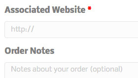
The Checkout Field Editor app allows you to add, edit, and remove fields shown on your shop's checkout page. Fields can be added and removed from the billing and shipping sections, as well as inserted after these sections next to the standard order notes.
Several field types are available, including text, checkboxes, select dropdowns, and datepickers. Core fields can also be moved around giving you much more control over your checkout.

Features
- Remove default fields from your checkout page
- Add new fields to your checkout page
- Simple drag & drop interface
- Rename default checkout fields
- Set required fields
- Choose field types
- Change checkout field order and positioning
Setup & Usage
Once you've activated the Checkout Field Editor app in your website admin panel, you can manage your site's checkout fields by heading to "Settings > Checkout Fields".

There are three sections of fields that you can manage:
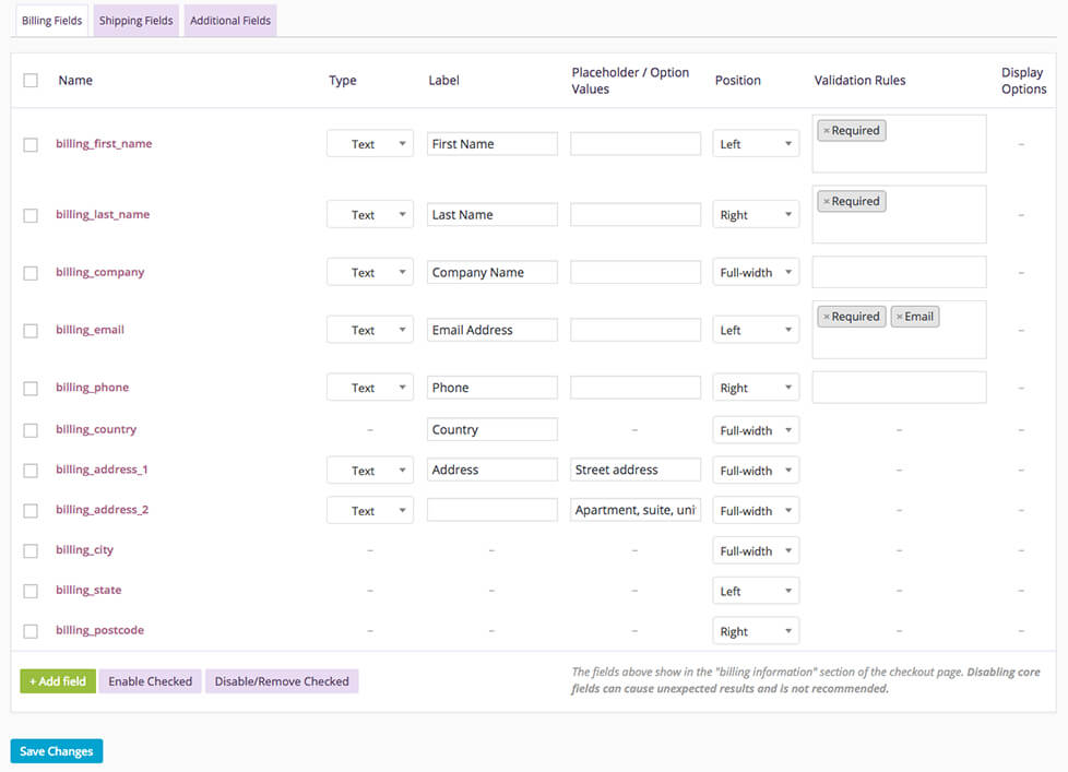
- Billing Fields - The payment & billing address section of your checkout (Payment must be enabled).
- Shipping Fields - The shipping section of your checkout (Shipping must be enabled).
- Additional Fields - Appear after the billing and shipping sections of the checkout, next to order notes (Order notes must be enabled).
Columns
Each field section table is made up of seven columns:
- Name - The name of the field, used as the meta key to save info. Must be unique.
- Type - Field type (see "Field types" below).
- Placeholder / Option Values - Placeholder text for inputs or the options for select boxes, radio buttons, etc. Multiple values should be separated by a pipe
|Eg.Option 1 | Option 2. Here's a few examples:- An options list starting with a pipe creates an empty choice. Used with a required select field, it will force the user to choose a valid option.
- An options list without a pipe as the first character will make the first option in the list the default choice whether the field is required or not.
- Position - Choose where you want the field to display. Options are Left, right, or full width.
- Validation Rules - Optionally choose from validation rules to apply to the field. Make the field required, or ensure it contains an email address or numbers only.
- Display Options - Optionally display fields in thank you emails, thank you pages, and on order details pages.
Field types
You can choose the following field types on your checkout form:
- Text - A standard text input box (single line).
- Password - Password text input box.
- Textarea - A textarea field input box (multiple lines).
- Select - A dropdown/select box. Requires options to be set in "Placeholder / Option Values".
- Multiselect - A multi-select box. Requires options to be set in "Placeholder / Option Values".
- Radio - A set of radio button inputs. Requires options to be set in "Placeholder / Option Values".
- Checkbox - A checkbox field.
- Date picker - A text field with a date picker attached.
- Heading - Adds a heading to allow separating fields into groups.
Editing core checkout fields
In the Billing Fields & Shipping Fields sections, the default core fields are highlighted in purple. Disabling or modifying core fields can cause unexpected results and is generally not recommended.
Some core fields have options disabled and cannot be changed. These include names of core fields, types of core fields (country and state), and fields that change dynamically based on the chosen country of a user (address 1, address 2, city, state, postcode) cannot have custom validation rules. With those limitations in mind you can change the labels and position of the fields, or disable them by ticking the checkboxes per-row and clicking the "Disable/Remove Checked" button at the bottom of the table. Disabled fields are then greyed out. You can re-enable core fields by checking the rows and clicking the "Enable Checked" button at the bottom of the table. Use at your own risk.
Adding and editing custom checkout fields
To add a custom checkout field, click the "Add field" button at the bottom of the fields table. Once a field is added, a blank row appears.

Enter the field options and preferences and hit the "Save Changes" button at the bottom of the table.
